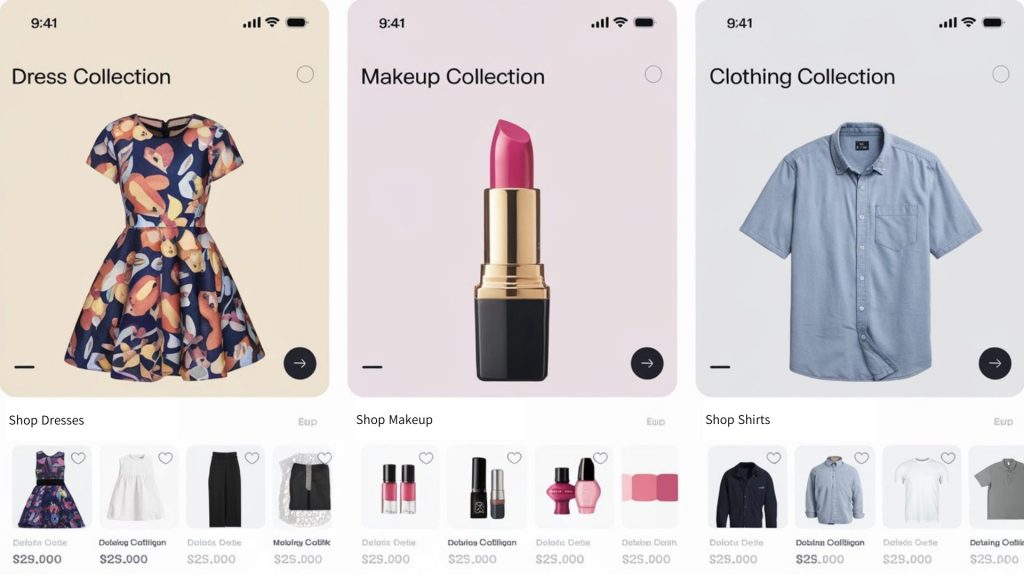
In-app messages are a cornerstone of modern user engagement, offering real-time opportunities to drive specific actions, share updates, or guide user behavior. However, creating effective in-app messages requires more than catchy copy-it demands a thoughtful approach to design. For many CRM marketers, this presents a unique challenge: how to balance the technical and strategic aspects of their role with the artistic demands of design, all without formal training in the field. Poor in-app message design can frustrate users and diminish the value of your app, while well-crafted messages can boost engagement and conversion rates.
This guide combines advanced design principles with practical insights from The Non-Designer’s Design Book to help CRM marketers craft visually stunning, effective, and user-focused in-app messages. Designing these messages requires a thoughtful blend of aesthetics, functionality, and psychology. Mastering these principles will empower you to create messages that captivate users and align with your strategic objectives.
Power of Contrast: Making Messages Pop
Contrast is one of the most critical design elements. It ensures that your content stands out and guides users’ eyes to what matters most. In The Non-Designer’s Design Book, Williams emphasizes the importance of strong contrast to create hierarchy and direct attention (2014).
Applications in In-App Messaging:
- Text and Background: Use contrasting colors to ensure readability. For example, white text on a dark background or black text on a light background provides clarity.
- Call-to-Action Buttons: Highlight CTAs with colors that sharply contrast with the surrounding elements. A bright orange button on a muted background naturally draws attention.
- Typography Contrast: Pair bold headlines with lighter, smaller body text to establish a clear hierarchy.
Example: A notification promoting a sale could feature a bold red headline like “FLASH SALE: 50% OFF!” paired with smaller, neutral text explaining the offer. The CTA button might be bright yellow to grab attention instantly.

Alignment: Creating Order and Clarity
Alignment ensures that every element in your design feels intentional. Williams (2014) describes alignment as a way to create order and remove visual confusion, which is crucial for users scanning in-app messages. Read our past article and learn types of in-app message.
Alignment Strategies:
- Consistent Margins: Align text and images along the same invisible edge, whether left, right, or center. This creates a sense of order.
- CTA Placement: Always align CTA buttons with the text above them for intuitive navigation.
- Grids and Guides: Use grids to maintain consistent spacing and alignment, especially in multi-element messages.
Expert Tip: Avoid “center-heavy” designs where everything is centered without structure. Instead, align headlines to the left and use proximity to group related elements logically.
Repetition: Reinforcing Brand Identity
Repetition strengthens visual cohesion and reinforces brand identity. By repeating design elements like fonts, colors, or icons, you create a consistent experience across all your messages.
How to Use Repetition in In-App Messages:
- Fonts and Colors: Stick to your app’s primary font and color palette to maintain brand consistency.
- Iconography: Use the same style of icons (e.g., flat vs. 3D) to avoid a mismatched aesthetic.
- Message Templates: Develop reusable templates for onboarding, promotions, or updates. This saves time while ensuring consistency.
Practical Example: If your app uses a blue and white color scheme, every in-app message should reflect this through buttons, text, and imagery. This consistency builds user trust and recognition.
Proximity: Grouping Related Elements
Proximity refers to placing related elements close together to show their connection. Williams (2014) highlights proximity as a tool to reduce cognitive load and enhance comprehension.
Applying Proximity:
- Text and Buttons: Place CTAs directly below the explanatory text to make their connection clear.
- Grouped Information: Use proximity to cluster related details, such as event dates, times, and locations, in a notification.
- Spacing: Avoid excessive white space between grouped items, as it can disrupt the visual flow.
Advanced Tip: Use subtle dividers or background shading to separate unrelated content without disrupting the overall design.

Strategic Use of White Space
White space, often called “negative space,” is not empty space-it’s an essential design tool. Proper use of white space can make your in-app messages feel more organized and easier to read.
Benefits of White Space:
- Focus: Direct attention to key elements, like CTAs.
- Readability: Prevent messages from feeling overcrowded or chaotic.
- Professional Look: Create a polished, minimalist aesthetic.
Example: A promotional in-app message could feature a headline, a brief description, and a CTA, with ample white space between each element to prevent overwhelm.
Typography: The Art of Readable Text
Text is the foundation of any in-app message, and its clarity determines whether users quickly understand your message or dismiss it entirely. A study by Google found that users form a “gut feeling” about a design in less than 50 milliseconds (Google, 2012). For in-app messages, this means the design must instantly communicate its purpose and value through clear typography, effective color choices, and intuitive layouts to capture user attention. Williams (2014) emphasizes the importance of combining legibility with style to enhance communication.
Best Practices:
- Font Pairing: Pair a bold sans-serif headline font with a clean serif body font for a professional yet approachable look.
- Size Hierarchy: Use size to indicate importance, with headlines being the largest, subheads smaller, and body text the smallest.
- Line Spacing: Use 1.5x line height for readability, especially in multi-line messages.
Mistakes to Avoid:
- Overusing all-caps, which can feel like shouting.
- Using decorative fonts in body text, which can hinder readability.
Advanced Use of Color Psychology
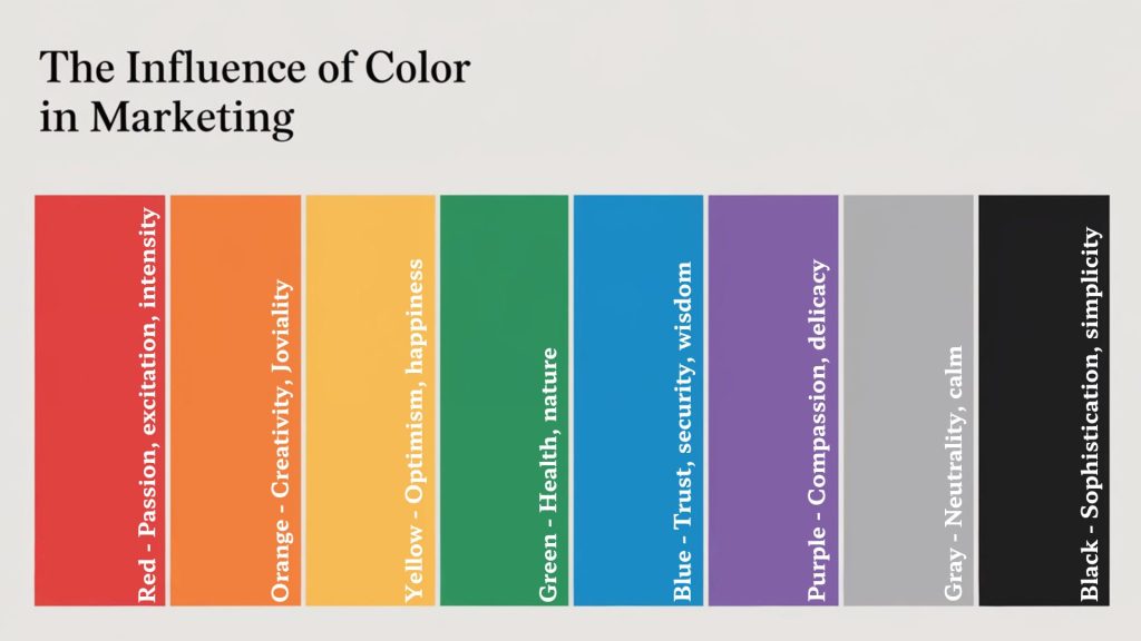
Color plays a vital role in guiding user attention and influencing emotions. According to a study by Loyola University, color increases brand recognition by up to 80% (Loyola University, 2023). They are not just visual elements-they evoke emotions and drive behavior. Williams (2014) discusses how color choice impacts user perception and mood.
Psychological Associations:
- Blue: Trust, reliability, and calmness. Commonly used for customer service messages. Also ideal for informational messages.
- Red: Urgency and passion. Effective for time-sensitive offers.
- Yellow: Optimism, happiness, and energy. Best used sparingly as an accent.
- Green: Health, growth, and success. Perfect for progress updates.
Practical Tip: Use tools like Adobe Color to experiment with color harmonies, ensuring your palette remains cohesive and impactful.

Icons and Imagery: Enhancing Understanding
Visual elements like icons and images enhance message comprehension by providing context and breaking up text-heavy designs. They can also convey complex ideas quickly. Williams (2014) notes that visuals should complement, not compete with, your message.
Best Practices:
- Simplicity: Choose simple icons or images that enhance the message without distracting users.
- Relevance: Select visuals that align directly with the content being conveyed.
- Alt Text: Provide concise descriptions for all images to improve accessibility and SEO.
- Recognition: Opt for universally recognized icons, like a magnifying glass for search or a trash can for delete.
- Scaling: Use vector formats like SVG to ensure icons remain crisp on high-resolution screens.
- Consistency: Maintain a cohesive icon style across all in-app messages to reinforce brand identity.
Advanced Example: For a fitness app, an in-app message reminding users to “Log your workout” might include a simple icon of a stopwatch alongside a motivational image of someone exercising.
Real-World Case Studies: The Power of Great Design
Airbnb: Simplifying Onboarding
Airbnb leverages alignment and proximity to deliver concise, user-friendly onboarding messages. By grouping related steps and aligning text with visuals, they create amazing experiences (Rocket.Chat, 2023).
Canva: Creative Simplicity
Canva employs repetition and proximity to guide users through design creation. Consistent use of brand colors and fonts enhances usability while reinforcing their visual identity (Braze, 2023).
Wrapping Up
Mastering in-app message design requires a deep understanding of design principles and user psychology. By applying contrast, alignment, repetition, proximity, and thoughtful use of typography and color, you can create messages that captivate and convert. Leverage these strategies to elevate your CRM marketing efforts and keep users engaged.